
Join 8,587 professionals who get data science tutorials, book recommendations, and tips/tricks each Saturday.
New to Python and SQL? I'll teach you both for free.
I won't send you spam. Unsubscribe at any time.
Issue #12 - Interpreting ML Models with Data Visualization
This Week’s Tutorial
NOTE - This week's tutorial will assume you've read last week’s tutorial in this series.
While permutation feature importance is a powerful tool for interpreting complex ML models, it's often the case that your business stakeholders will want more understanding of how the model works.
For reference, here's the permutation feature importance for the model:

And the current interpretability of the model based on previous work:
Estimated average model accuracy is 81.3%.
However, the model's accuracy will range from 79.2% to 83.4%.
The model scored 81.4% accuracy on the test dataset.
The model is 5.5% more accurate for high-income earners on the test dataset.
The most important features for making predictions are whether someone is a married civilian, their age, and the amount of any capital gains they have.
Another powerful tool you can use to offer ML model interpretations are data visualizations.
I've found over the years with my clients that crafting visualizations based on permutation feature importance helps them develop an understanding how a model makes it predictions.
My go-to visualization library in Python is the mighty plotnine. If you're new to plotnine, check out the tutorial I offer as part of my free Python Crash Course.
As you will see in this tutorial, plotnine is the fastest, easiest way to create data visualizations that illustrate how important feature interactions drive the ML model's predictions.
At a high level, here's the process for using data visualization to interpret ML models:
Use the test dataset labels in the visualizations to align with permutation feature importance.
Create a visualization for each of the most important features.
Add the label values to the visualization.
Create visualizations incorporating multiple features, including the label.
Arrive at a subset of visualizations to present to business stakeholders.
As always, try to focus on 1-3 features for each visualization, not including the label.
As always, seeing the above expressed in code solidifies understanding.
First up, we can create a visualization of the MaritalStatus_Married-civ-spouse feature:


The above visualization is quite easy for business stakeholders to understand. The visualization clearly shows:
When the feature value is True, then almost 75% of the labels are >50K (i.e., the turquoise color).
When the feature value is False, then about 83% of the labels are <=50K (i.e., the coral color).
The visualization also explains why this feature ranked highest in the permutation feature importance - it contains a ton of information for making predictions.
The next most important feature is Age. As this feature is numeric, the go-to visualization is for interpretation is a histogram.
BTW - If you don't know how to analyze data with histograms, check out my Visual Analysis with Python online course.
Here's the code:

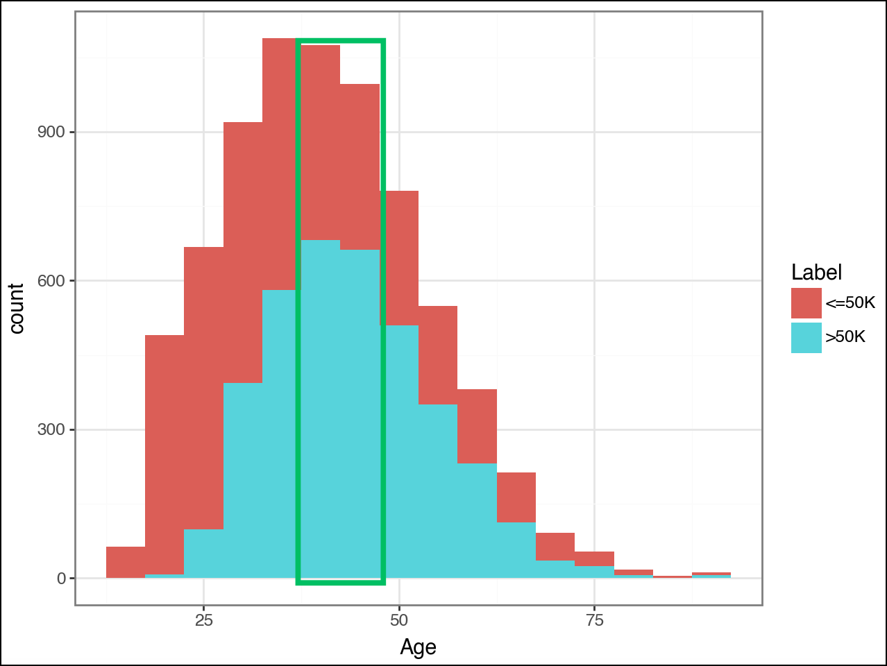
NOTE - In the visualization above, I added a green box in Canva as a highlight (i.e., the code doesn't draw the green box).
This second visualization shows why Age was not ranked as highly as MaritalStatus_Married-civ-spouse - there's not as much clear-cut information for making predictions.
Consider the histogram bins highlighted by the green box:
The bins correspond to US citizens aged from the high 30s to high 40s.
>50K is approximately 66% of the label values in these bins.
Now, consider the other histogram bins. Anywhere where the mixture of color approaches a 50/50 split shows where the model has problems using Age alone to make accurate predictions.
ML models based on decision trees are very good at learning rules like the following:
"If Age is between 39 and 49, predict >50K"
In ML terms, this is known as a decision boundary. Understanding how an ML algorithm creates decision boundaries is critical in real-world machine learning. Especially for interpreting models.
I cover how decision tree-based algorithms create decision boundaries and how you use this knowledge to engineer the best features in my Introduction to Machine Learning online course offered in partnership with TDWI.
Moving on, the CapitalGain feature was ranked as 3rd most important:


This visualization shows the following:
For US citizens with a value of zero for CapitalGain, it's about a 50/50 split between the two labels.
US citizens with values greater than zero for CaptialGain, the label values are overwhelmingly >50K.
Relatively speaking, there are very few US citizens with CapitalGain values greater than zero.
Again, there is some information for making accurate predictions in the CaptialGain feature, but it isn't nearly as rich as what the MaritalStatus_Married-civ-spouse feature provides.
Next up, as humans are more sensitive to negativity than positivity, it can be useful to provide a visualization of a non-important feature as a counter-example.
The CapitalLoss feature is a reasonable choice as a counter-example:


The visualization has this to say about the CapitalLoss feature:
The vast majority of US citizens have no CapitalLoss (i.e., zero), and the label split is close to 50/50.
US citizens with a CaptiaLoss overwhelmingly have the >50K label, but there are very few in the dataset.
A counter-example like this can go a long way in helping your business stakeholders build understanding and trust in the model.
It's a good idea to start "warming up" your business stakeholders using single feature visualizations like the above. With them warmed up, then it's time to dive into feature interactions.
While the visualizations are a little more complicated, visualizing feature interactions is the most powerful way to explain the ML model to your business stakeholders.
Again, we'll use the permutation feature importance scores to guide the visualizations.
First up, the interaction of the top two features:


The first visualization shows that the MaritalStatus_Married-civ-spouse already contains much information for making accurate predictions.
The way to think about the above interaction visualization is how the Age feature helps to refine the model's predictions. Here's what the interaction visualization tells us:
Across the Age distribution, when MaritalStatus_Married-civ-spouse is False, the <=50K label is by far the most common.
When MaritalStatus_Married-civ-spouse is True, the <=50K label is the most common at the young end of the Age distribution.
When MaritalStatus_Married-civ-spouse is True, the >50K label is by far the most common starting around 28 years of Age.
Again, ML algorithms based on decision trees are very good at learning these interaction rules from the data.
Now for the next two-way interaction:


Again, the interaction of CaptialGain with MaritalStatus_Married-civ-spouse helps to refine the model's predictions, particularly in the case with MaritalStatus_Married-civ-spouse is False.
Lastly, you can craft an interaction visualization of the 3 most important features:
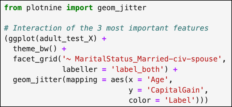

The above visualization can help communicate the power of the ML models to business stakeholders due to the complexity shown in the visualization.
Decision tree models, in particular, are very good at segmenting the dots in the visualization into areas where accurate predictions can be made (I detail this process in my Introduction to Machine Learning online course).
If you think your business stakeholders can handle it, you can even create 4-way interactions:


The above visualization is just one more iteration of the same idea - additional features demonstrate how the ML model can make ever more fine-grained predictions by carefully segmenting the dots by color.
In practice, I've rarely found that I've needed more than permutation feature importance and data visualization to provide interpretations/explanations for my business stakeholders.
However, there's another option that I've found useful in the past.
This Week’s Book
I'm a big fan of the plotnine library because it is a port of the ggplot2 library from the R programming language.
IMHO, ggplot2 is the best data visualization library for DIY data science. Luckily, the definitive book on ggplot2 is available online for free:

Just in case you're curious why I would recommend an R book, here's the answer.
Plotnine code is very close to ggplot2 code. Where it isn't, a quick prompt to ChatGPT will translate ggplot2 to plotnine.
That's it for this week.
Stay tuned for next week's newsletter, where I will teach how to use surrogate models for interpretation.
Stay healthy and happy data sleuthing!

Dave Langer
Whenever you're ready, there are 4 ways I can help you:
1 - Are you new to data analysis? My Visual Analysis with Python online course will teach you the fundamentals you need - fast. No complex math required, and it works with Python in Excel!
2 - Cluster Analysis with Python: Most of the world's data is unlabeled and can't be used for predictive models. This is where my self-paced online course teaches you how to extract insights from your unlabeled data.
3 - Introduction to Machine Learning: This self-paced online course teaches you how to build predictive models like regression trees and the mighty random forest using Python. Offered in partnership with TDWI, use code LANGER to save 20% off.
4 - Is machine learning right for your business, but don't know where to start? Check out my Machine Learning Accelerator.